The Vitruvian Man and a new Humanism

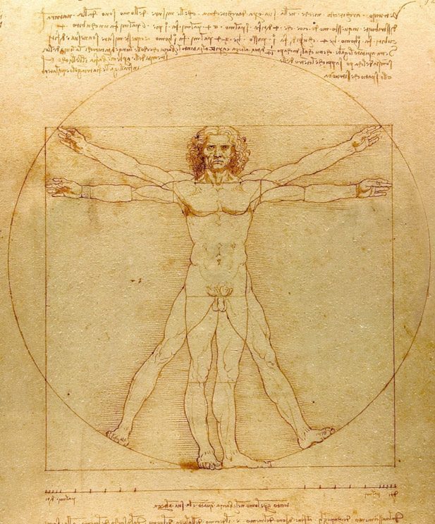
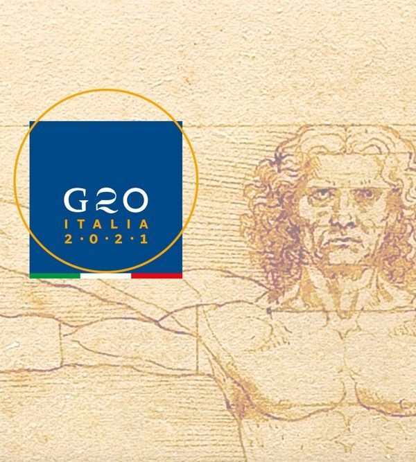
The G20 logo project draws its inspiration from the famous ” Vitruvian Man”, a drawing by Leonardo da Vinci, symbol of the Renaissance, Humanism and of Italy throughout the world.
In its compositional synthesis, Leonardo’s work conceptually embraces the qualities that define the Renaissance man. Stable and balanced, living in harmony with the world and aware of his place within it.
Two primary geometric shapes contain the human body, presented in a double pose: the square, a sign of centering and stability, and the circle, Platonic image of perfection, symbol of motion and of the absolute. Leonardo’s Vitruvian Man stands upon the foundations of both the square and the circle. The first is an expression of stability. The second, a sign of dynamism, tending towards infinite motion.
Within the G20 logo, the blue square represents Italy, while the golden circle symbolizes the globe and the circular motion of regeneration.
The word “G20” conceptually replaces the figure of Man. As in the original artwork, which presents the human figure as a point of contact between two worlds, we envisage that Italy, on this important international event, can act as a hub to settle the new “proportions of the world”.
The characters of the logo

The three characters of the G20 logotype recall and represent the typical shapes of Italian architecture and lettering. A meaningful, clear and highly recognizable composition that condenses, in its elegance, over 2000 years of history.
The “G” evokes Imperial Rome and is inspired by the letters engraved in the base of the Trajan Column, one of the capital’s symbolic monuments.
The “2” is a tribute to the Bodoni, expression of the excellence of Italian typography throughout the world. Depicted in a neoclassical font designed in 1798 by prominent engraver Gian Battista Bodoni, it features a strong contrast between thick and thin lines, representing elegance and harmony.
The modernist “0”, a circle written with rigorous geometry, encapsulates the essence of rationalist thought and of the artistic avant-garde, such as the Futurism movement, which gave new life to contemporary visual culture.
Finally, the “Italia – 2021” sub-heading is written in the “Sole Sans” font, developed by the Italian C-A-S-T foundry and designed by Riccardo Olocco and Luciano Perondi.